Core Features
Understanding your Reports dashboard
A quick visual read on trip volume — no setup required, it fills in automatically as trips are scheduled.
What you'll see
- Go to 📊 Reports.
- Four stat tiles: Trips This Month, Completed This Month (with % of scheduled), Cancelled This Month, and Busiest Day (last 8 weeks).
- 📈 Trips per Month — a bar chart of the last 6 months.
- 📅 Trips by Day of Week — a bar chart of the last 8 weeks, showing which day you run the most trips.
- 🧭 Trip Types — a donut chart of trip types over the last 90 days.
- 🚐 Vehicle Share — a donut chart of which vehicles carried trips over the last 90 days.
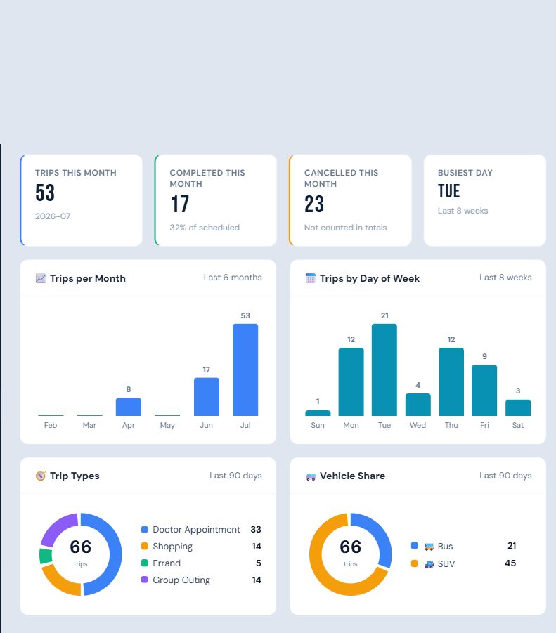
If no trips have been scheduled yet, you'll see "No trip data yet" instead of empty charts.
Who can do this
Managers and admins.
Notes
- Cancelled trips are excluded from the volume charts and stat totals (except the Cancelled tile itself).
- All charts are built from your own facility's data only — nothing is compared across facilities.